Creating an inviting and effective homepage isn’t just about aesthetics—it’s about making sure that the first impression you give your visitors is a great one. Imagine walking into a messy store with poor lighting and no clear signs showing where things are. You’d likely feel frustrated, even uncomfortable, and walk out. A poorly designed homepage has a similar effect; visitors might get frustrated and leave, taking their business with them.
In this article, we’ll dive into some common homepage design mistakes and explore how to turn your homepage into a customer magnet.
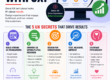
Why Your Homepage Is (Probably) the Most Important Part of Your Website
When customers land on your homepage, it’s like shaking hands with a stranger—first impressions mean everything. Studies show that users decide within seconds if they want to stick around or not. A clean, organized, and purposeful homepage invites them to explore further, while a confusing, cluttered one can make them bounce without a second thought. But it’s not just about looking pretty. Your homepage should do three things:
- Set the tone for what your brand is about.
- Showcase your main offerings in a clear, digestible way.
- Guide visitors to take the next step, whether that’s reading more, contacting you, or purchasing something.
Let’s look at the most common homepage mistakes that drive customers away and explore how to avoid them.
Mistake #1: Slow Loading Times
Why It Matters
How many times have you clicked on a site, watched the loading icon spin for more than a few seconds, and decided it wasn’t worth the wait? I know I have—especially when I’m on my phone. Speed matters so much because people expect quick answers, and if they don’t get them, they’re gone. A slow-loading homepage can kill your chances of making a good first impression.
Fix It
Optimize images, reduce the number of plugins, and consider using a Content Delivery Network (CDN). Sometimes, a simple tweak like compressing images can make all the difference in how fast your homepage loads.
Mistake #2: A Cluttered, Confusing Layout
Why It Matters
A cluttered homepage can overwhelm visitors, making it difficult for them to find what they’re looking for. A few years ago, I worked with a client who had packed their homepage with everything from blog posts to testimonials to endless product listings. It felt like a maze. Simplifying their homepage design made a big difference. When things are organized and visually appealing, users are more likely to stick around and find what they need.
Fix It
Embrace a clean, minimalist layout. Start with a headline that clearly explains who you are and what you offer, followed by a few well-chosen images and a clear call-to-action (CTA). Don’t try to say everything at once; give your users the space to breathe and navigate with ease.
Mistake #3: Weak or Missing Calls to Action (CTAs)
Why It Matters
Imagine going to a coffee shop where there’s no clear indication of where to order. You’d feel lost, maybe even frustrated, right? The same applies to your homepage. If there isn’t a strong call-to-action, visitors won’t know what to do next. They’ll be left wondering, “Should I contact you? Buy something? Sign up for a newsletter?”
Fix It
Your CTAs should stand out, be easy to understand, and, ideally, create a sense of urgency. Try action phrases like “Get a Free Quote,” “Shop Our Bestsellers,” or “Book Your Consultation Today.” Place them in prominent spots where people can’t miss them.
Mistake #4: Unclear or Overly Technical Messaging
Why It Matters
Have you ever read a description of something and thought, “Wait, what does that even mean?” Complex or unclear language on your homepage can turn people off instantly. If a visitor can’t quickly grasp what your business does or how it benefits them, they’re more likely to leave.
Fix It
Use simple, straightforward language that focuses on the customer’s needs and pain points. Rather than saying, “Our solutions utilize cutting-edge AI to optimize workflows,” try “We use smart technology to save you time and money.” Speak their language and prioritize benefits over technical jargon.
Mistake #5: Poor Mobile Optimization
Why It Matters
More than half of all web traffic now comes from mobile devices. If your homepage isn’t mobile-friendly, you could be losing a huge chunk of potential customers. A couple of years ago, I remember redesigning a client’s homepage that looked fantastic on desktop but was a mess on mobile—text was too small, images didn’t load properly, and buttons were hard to click. It’s safe to say it was costing them business.
Fix It
Check your homepage on multiple devices to ensure it’s easy to navigate on smaller screens. Use responsive design to automatically adjust content for mobile users, and avoid clutter that can make your site load slowly on mobile devices. Mobile optimization is essential if you want to keep those visitors engaged.
Mistake #6: Lack of Social Proof or Trust Indicators
Why It Matters
People trust people. If potential customers see that others have had positive experiences with your business, they’re more likely to trust you too. When a homepage lacks testimonials, client logos, reviews, or other trust indicators, it can feel impersonal and unproven.
Fix It
Feature a few compelling customer testimonials on your homepage, or add logos of clients you’ve worked with. Trust badges or awards can also build credibility. Make sure these elements are easy to spot, but don’t let them dominate the page. The right balance will help reassure visitors that you’re the real deal.
Mistake #7: Ineffective or Generic Visual Design
Why It Matters
Let’s be honest: a visually unappealing website feels like an old, dusty storefront. Outdated colors, generic stock photos, or a lack of cohesive branding can give off a lackluster impression. I once helped a business owner who thought “design didn’t matter” as long as their products were good. But once we revamped the visuals, their engagement metrics soared.
Fix It
Invest in high-quality images and a cohesive color scheme that reflects your brand. Avoid using low-quality stock images; instead, aim for custom graphics or photos that feel unique to your business. If possible, hire a designer to create a polished, professional look.
Transform Your Homepage into a Customer Magnet
Now that you know some of the common mistakes to avoid, let’s look at how to use this knowledge to turn your homepage into a powerful conversion tool.
1. Focus on the User Experience (UX)
Make your homepage user-centric. Prioritize intuitive navigation, concise messaging, and CTAs that guide visitors naturally toward the next steps.
2. Speed and Mobile Optimization
Make sure your homepage loads quickly and is mobile-friendly to retain customers who are increasingly browsing from mobile devices.
3. Highlight Social Proof
Build credibility with testimonials, trust badges, and client logos. When visitors see that others trust your business, they’ll feel more comfortable engaging with you.
4. Emphasize the Value Proposition
Ensure your visitors can instantly understand the benefits of your products or services. Show them how you solve their problems, and make it easy for them to move from browsing to buying.
Final Thoughts: Make Your Homepage Work for You
It’s easy to overlook the importance of your homepage design, especially if you’ve been focused on your products or services. But a well-crafted homepage is the gateway to conversion—it’s where potential customers decide if they want to take the next step. By addressing these common mistakes, you’ll create a homepage that welcomes visitors, builds trust, and encourages them to stay.
Take the time to audit your homepage, or, if you’re ready to get serious about optimizing it, consider bringing in a professional web designer. Small changes can lead to big improvements, and a great homepage can be one of your business’s most valuable assets.